This post contains affiliate links. If you buy something through one of my links, I may earn a small commission at no extra cost to you. I only recommend products I’d actually use myself. As an Amazon Associate I earn from qualifying purchases.
Cottagecore split into two camps, and both want a spot in your apartment. Traditional cottagecore is the version most people picture first: cream walls, ditsy florals, light wood, a jug of wildflowers on the sill. Dark cottagecore takes the same countryside fantasy and moves it to dusk. Same pressed flowers, same vintage spirit, but the palette drops into ink, oxblood, forest green, and aged brass.
I get asked which one is “right” for a small rental constantly, and the honest answer is that it depends on exactly two things: how much natural light your space gets, and which mood you actually want to come home to. Square footage barely matters. Both styles work in 400 square feet.
This is the side-by-side I wish existed when I was deciding. I’ll compare them on palette, materials, light, and mood, then give you the representative pieces I’d actually start with for each. If you want the full room-by-room breakdown after this, I have a renter’s guide to dark cottagecore that goes deeper.
What the two styles share
Before the differences, the common ground, because it’s bigger than people assume.
Both are built on nature, nostalgia, and the handmade. Pressed botanicals, vintage silhouettes, natural fibers, a slight refusal of anything that looks factory-new. Both lean on layering rather than one big statement piece. And both are forgiving for renters, because the look lives in textiles, framed prints, and tabletop objects, not in paint or built-ins.
So if you already love one and wonder whether switching camps means starting over, it mostly doesn’t. The bones carry across. You’re changing the palette and the lighting, not the philosophy. The floral motif itself goes back to designers like William Morris, whose botanical patterns the Victoria and Albert Museum still documents, and you’ll see his influence quoted in both camps.
Palette: dusk versus daylight
This is the fastest way to tell them apart.
Traditional cottagecore is high-key. Cream, butter, sage, dusty rose, sky blue, warm honey wood. The whole point is that light bounces around the room. In a small space with decent windows, it reads open and airy, and it photographs bright.
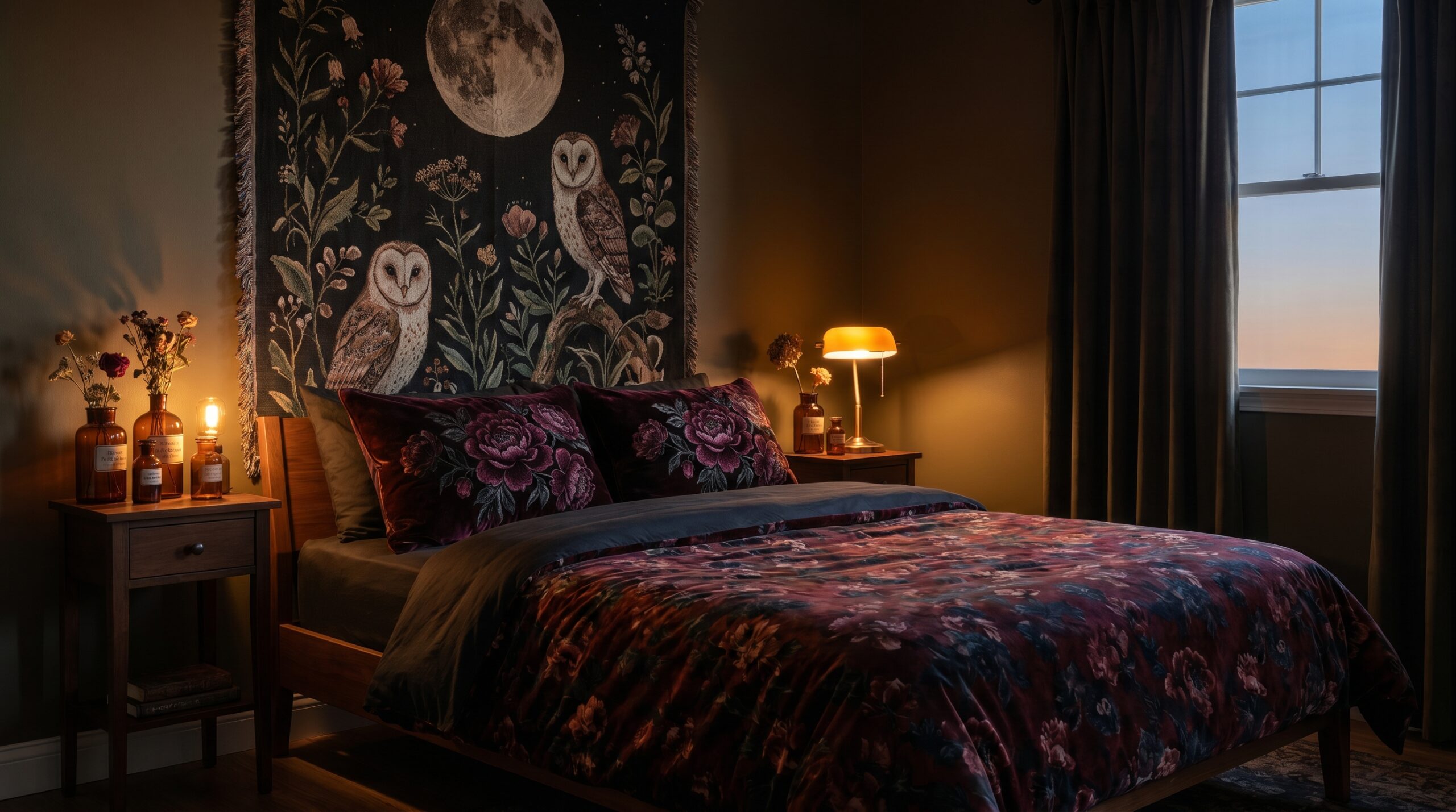
Dark cottagecore is low-key. Charcoal, oxblood, plum, deep olive, espresso wood, antique gold. Color sits in the textiles and the prints rather than the walls, since most renters can’t paint anyway. The effect is enveloping, not expansive.
My rule: match the palette to your light, not your wishlist. A north-facing studio that stays dim until noon will feel cave-like in full dark cottagecore, but cozy and intentional in the traditional palette. A bright corner unit that gets hammered with afternoon sun can take the darker scheme without feeling closed in, and the moodiness actually calms down all that glare.
Materials and textiles
Traditional cottagecore wants cotton, linen, eyelet, crochet, and pale woven baskets. Textures stay soft and a little rumpled. Think percale bedding, ruffled curtains, seagrass.
Dark cottagecore reaches for velvet, heavier weaves, moody florals on dark grounds, and metals with patina. The textiles do more visual work because the colors are richer, so you need fewer of them before a room feels full.
For a small space, that difference is practical. Traditional layering can pile up fast and start to look cluttered, so I keep the palette tight and let texture carry it. Dark cottagecore hits “finished” with less, which is genuinely useful in a tiny bedroom where every surface counts. If clutter is your worry either way, my cluttercore without the chaos piece has the restraint rules I use.
Lighting
Traditional cottagecore runs on daylight and warm, soft lamps. You’re amplifying brightness.
Dark cottagecore needs you to take over the lighting completely. Overhead light kills it. You want pooled, low, warm light from a few sources: a plug-in sconce, an amber bulb, a cluster of candles. Renters can do all of this without an electrician, and I broke down the exact fixtures in my dark cottagecore lighting guide.
If you hate fussing with lamps, traditional cottagecore is the lower-effort choice. It mostly just needs you to not block the windows.
Mood, and who each one is for
Traditional cottagecore feels like a bright spring morning. It’s optimistic, fresh, a little sweet. It suits people who want their home to feel calm and uncomplicated, and it’s the friendlier pick if you share the space with a partner who finds darker rooms heavy.
Dark cottagecore feels like a candlelit evening in an old cottage. It’s romantic, witchy, and a bit dramatic. It suits people who find pure-bright decor a little flat and want their apartment to feel like a retreat from a loud world.
Neither is more grown-up than the other. They’re different temperaments, full stop.
Dark cottagecore: the pieces I’d start with
You can build the dark version from four anchor pieces. I kept these renter-safe and small-space-sized.
Witchy Rabbit gothic botanical duvet set
This moody animal-and-botanical duvet is the fastest way to set the whole tone, because bedding is the largest soft surface in a small bedroom. It comes as a three-piece set (cover plus two shams), so one purchase dresses the bed. It’s a budget pick, which makes it a low-risk way to test whether you actually like living with the darker palette before you commit further.
See the Witchy Rabbit Duvet Set on Amazon
Set of 3 (duvet cover + 2 shams), microfiber, dark-academia botanical print. Not for: light sleepers who want a bright wake-up, since dark bedding makes a room read dimmer in the morning.
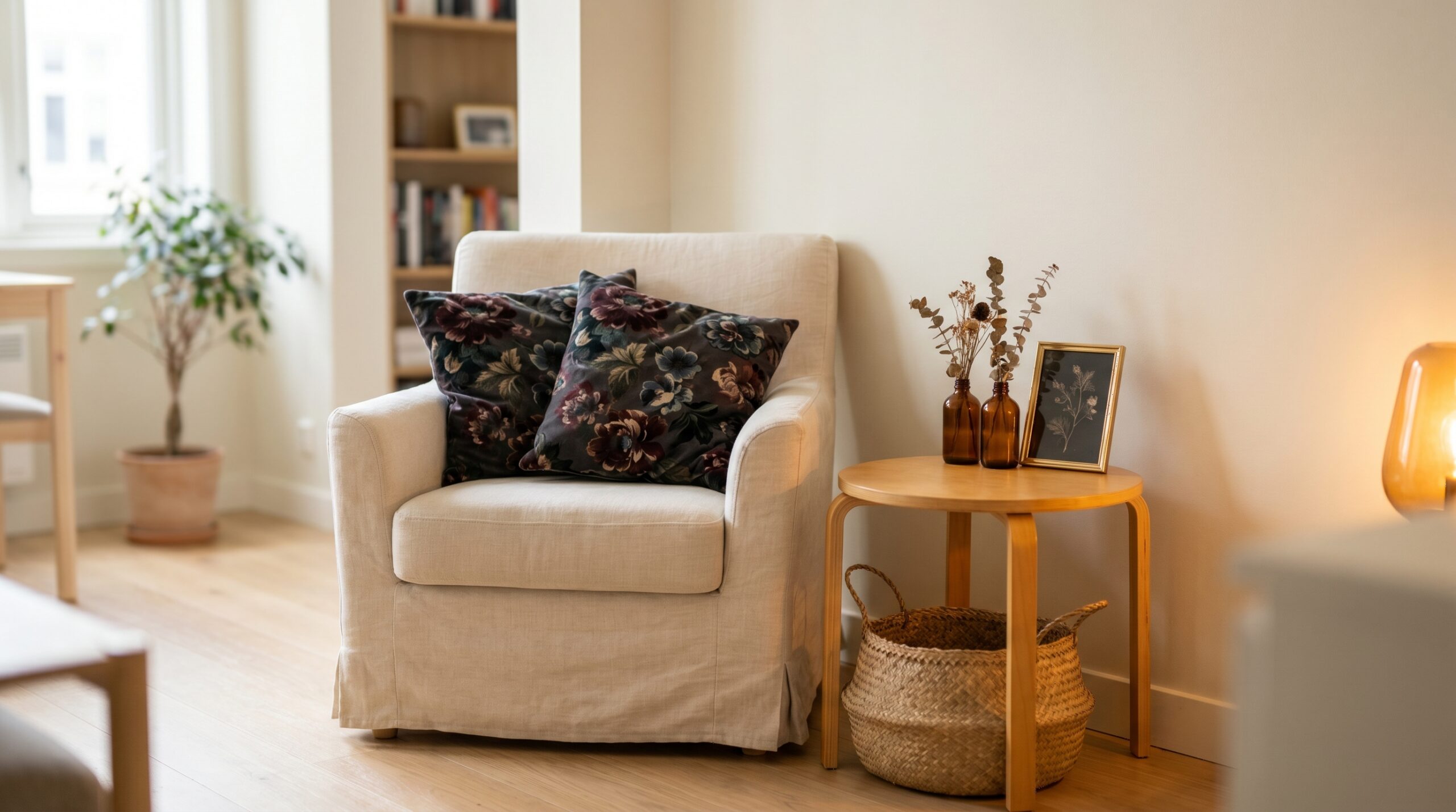
Moody floral velvet pillow covers
A set of two gothic-peony pillow covers in soft peach-skin velvet. These are covers, not full pillows, so they ship flat and slip over inserts you already own. This is the cheapest entry point into the style and the one I recommend testing first.
See the Moody Floral Pillow Covers on Amazon
Set of 2, 18 x 18 in, peach-skin velvet, hidden zipper, covers only. Not for: homes with a cat who treats velvet as a scratching surface.
Moody owl and moon floral tapestry
A large dark-academia owl-and-moon botanical tapestry does the job of an expensive piece of wall art for a fraction of the cost, and it hangs with barb clamps or non-marking hooks, so no nail holes. In a small room it covers a lot of blank wall in one move. This one was in stock and moving fast when I checked.
See the Moody Botanical Tapestry on Amazon
Soft polyester, HD print, no-drill barb-clamp or nail-hook mounting. Not for: anyone who wants crisp framed prints rather than soft fabric.
Amber glass apothecary bud vases
A set of eight small amber bottles. Cluster three on a shelf with a single dried stem in each and the apothecary mood lands instantly. Eight pieces means you can spread them across a bedroom, a bathroom, and a windowsill from one budget order.
See the Amber Glass Bud Vases on Amazon
Set of 8, approx 6.5 in tall, 17 oz, wide neck. Not for: people who want big blooms, since these are narrow bud vases.
Traditional cottagecore: the pieces I’d start with
Same four-anchor approach, daylight version.
Ditsy floral cotton duvet set
A cream-ground ditsy floral in 100% cotton percale, Full/Queen, with two shams. This is the splurge of the group and worth it, because percale cotton breathes and washes better than the microfiber most cottagecore bedding uses, and bedding is the piece you touch every night.
See the Ditsy Floral Cotton Duvet on Amazon
100% cotton percale, 200 thread count, Full/Queen 90 x 90 in, 2 shams (no comforter). Not for: tight budgets, since real cotton costs more than the dark microfiber set above.
White ruffle cafe curtains
A set of two short tiered-ruffle panels. Cafe length is the small-space trick here: they cover the bottom half of a window for privacy while leaving the top open for light, which is exactly what a dim apartment needs. They hang on a tension rod or clip rings, so they’re fully renter-safe.
See the White Ruffle Cafe Curtains on Amazon
Set of 2, 27 in W x 36 in L per panel, 5-tier ruffle, rod-pocket top. Not for: anyone who needs full blackout coverage.
Hand-woven seagrass baskets
A two-pack of natural seagrass baskets with wooden handles. They’re the workhorse of traditional cottagecore: open storage that looks like decor. In a small apartment they hide the clutter that would otherwise break the calm, and they read as warm texture rather than plastic bins. A mid-tier price that earns its keep.
See the Seagrass Baskets on Amazon
2-pack, hand-woven natural seagrass, wooden carry handles. Not for: anyone needing lidded, dust-proof storage.
Rustic white ceramic jug vase
A matte, textured farmhouse jug that holds fresh, faux, or dried stems. One of these on a table with a few grocery-store flowers is the most traditional-cottagecore image there is. The unglazed bisque finish keeps it from looking cheap, and it was in stock when I checked.
See the Rustic White Ceramic Jug on Amazon
Matte unglazed bisque, textured, watertight, with handle. Not for: people who want a matching set rather than one statement object.
Which one should you actually pick?
Here’s how I’d decide, fast.
Choose traditional cottagecore if your space is dim and you want it to feel brighter, if you share it with someone who finds dark rooms heavy, or if you want the lowest-effort version that mostly runs on daylight.
Choose dark cottagecore if you get good natural light and want the room to feel like a retreat, if bright-and-sweet decor leaves you cold, or if you want a finished look from fewer pieces in a tiny bedroom.
And if you can’t choose, you don’t have to. The smartest small-space move is to mix them: keep the walls and big surfaces light and traditional so the room stays open, then add dark cottagecore in the small, swappable pieces (the velvet pillows, the amber bottles, a single moody print). You get depth without the room closing in, and you can dial it darker over time. For the bedroom specifically, my dark cottagecore bedroom guide shows how far you can push it before a small room feels cramped, and the bedding roundup covers the sizing for small beds.
Frequently Asked Questions
Is dark cottagecore harder to pull off in a small apartment?
Not harder, just more lighting-dependent. It actually needs fewer pieces than traditional cottagecore to feel complete, which helps in a tiny room. The one requirement is warm, low light from a couple of sources instead of a single overhead fixture.
Can I mix dark and traditional cottagecore?
Yes, and in a small space it is often the best call. Keep large surfaces light so the room stays open, then layer dark cottagecore into pillows, glass, and one piece of wall art. The shared botanical-and-vintage DNA makes them blend without clashing.
Which one is more renter-friendly?
They are about equal. Both live in textiles, tabletop objects, and no-drill wall pieces like tapestries and tension-rod curtains. Neither needs paint or permanent fixtures, so you can take the whole look with you when you move.
Will dark cottagecore make my small room feel smaller?
It can if your room is already dim, because dark colors absorb light. In a space with good natural light it reads cozy rather than cramped. If you love the style but worry about your light, mix it: dark accents on light walls keeps the room feeling open.
Do I need real antiques for either look?
No. Both styles are about the vintage feeling, not provenance. Reproduction prints, new-but-rustic ceramics, and affordable florals all read correctly. Save the hunt for one or two pieces you genuinely love and let affordable items carry the rest.