Beige minimalism is done. Pinterest’s Color-Forward Maximalism trend is the swing back, and the saves are stacking up around five specific hues: burgundy, chocolate brown, navy, amethyst, and deep terracotta. The question that keeps showing up in the comments under every one of those pins is the same: can I do this in 600 square feet without making the room feel like a closet?
Short answer: yes, with rules. I’ll get into the when-dark-works and when-dark-doesn’t logic below, then walk through 12 specific renter-friendly picks I’d actually use, organized by color. Every product is verified in-stock as of 2026-05-19. Every link is an Amazon affiliate link.
This post contains affiliate links. If you buy something through one of my links, I may earn a small commission at no extra cost to you. I only recommend products I’d actually use myself.
As an Amazon Associate I earn from qualifying purchases.
Top pick if you’re starting from zero
Start with the HWY 50 burgundy velvet pillow covers ($15-ish for two). One pair on a neutral sofa tells you within a week whether the saturated-color move is right for your room without committing $200+ to a rug or curtains. If it works, layer up. If it doesn’t, the covers slip off in 30 seconds and you’ve spent less than a dinner out finding out.
When dark colors work in a small apartment (and when they don’t)
This is the section every other roundup skips and it’s the one that matters. Dark colors don’t make small rooms feel smaller automatically. Bad dark-color decisions do. Here’s the breakdown.
Dark works when:
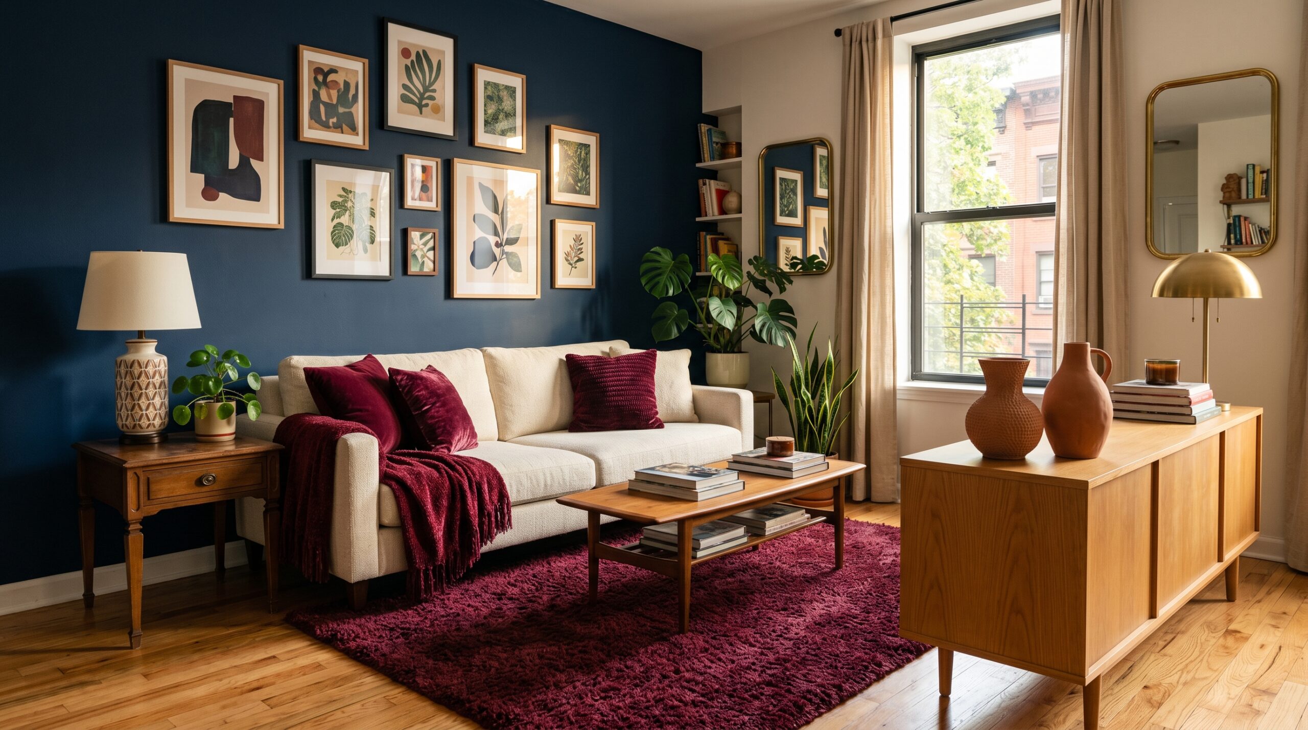
- You have light flooring. A burgundy rug on bleached oak reads as a warm anchor. A burgundy rug on dark walnut reads as a tunnel.
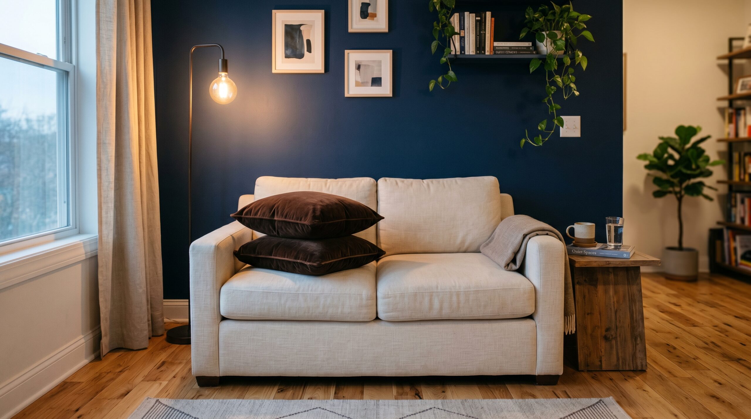
- You use it as an accent wall or single feature piece, not the whole envelope. One navy peel-and-stick wall behind the bed is sophisticated. Four navy walls is a cave.
- The room gets at least 4 hours of direct natural light per day. Saturated color needs light to reveal its depth. Without light, it goes flat.
- You leave the largest object (usually the sofa) in a neutral tone and let the saturated pieces orbit it. The eye needs a place to rest.
Dark doesn’t work when:
- Your ceilings are under 8 feet. Dark walls on a low ceiling drop the visual cap. Stick to dark accents (rug, throw, art) and keep walls in a warm cream.
- The room is north-facing with minimal natural light. Without warm sun, saturated colors read as cold and heavy. Pivot to terracotta and burgundy (warm-leaning) and skip the navy and amethyst (cool-leaning) for the wall and floor pieces.
- You already have dark upholstery. Adding saturated color on top of a dark sofa stacks too much weight in the lower half of the room. Either swap the sofa or treat it as the dark anchor and keep walls and rugs lighter.
- You’re committing to permanent paint or wallpaper. Renters should default to peel-and-stick wallpaper or textile-based saturation (rug, curtains, throw) so the move is reversible.
How I picked these 12
- Renter-safe priority: no-drill, no-paint, no permanent install. Curtains use tension rods, wallpaper peels off clean, rugs roll up.
- True color saturation. I rejected anything that read as a watered-down version of the named hue. Burgundy needs to be burgundy, not maroon-pink.
- Stock check on 2026-05-19. Several velvet-pillow listings in these colors turn over fast on Amazon. The picks below were buyable at the time of writing.
- Scale that fits small spaces. The rugs are 5×7. The curtains are 84 inches. The pillows are 18 inches. No oversized statement pieces that swamp a 600 sq ft room.
- One product per hue minimum, so you can build a balanced room from the list without leaning on a single color.
Burgundy (4 picks)
Burgundy is the easiest of the five hues to land in a small apartment. It reads warm under most lighting, it pairs with both warm and cool neutrals, and it doesn’t go cold the way navy and amethyst can.
1. HWY 50 burgundy velvet pillow covers (set of 2)
The HWY 50 18×18 velvet pillow covers are the cheapest viable way to test this whole aesthetic. Hidden zipper, true burgundy (not maroon-pink, not wine-purple), and the velvet is dense enough to look more expensive than it is. Best for: anyone starting from a neutral sofa.
2. Pickluc burgundy blackout curtains (84 inches, set of 2)
The Pickluc 52×84 blackout panels are the renter move that takes the saturation from accent to architectural. Grommet top hangs from any tension rod (no brackets to screw in), thermal-insulated, and the burgundy reads true under both daylight and warm-bulb evening lighting. Hang two panels per window, even if the window is narrow. Pooled fabric is the point.
3. PAVILIA burgundy chenille throw blanket
The PAVILIA 50×60 chenille throw with tassel fringe is the third burgundy piece I’d add to a sofa, draped over the back corner. Soft hand, true wine-red, and the tassel detail keeps it from reading too sleek. Skip the fleece version of this same line. The chenille is the right weight for the look.
4. FALARK burgundy plush area rug (5×7)
If you only buy one big-ticket burgundy piece, make it a rug. The FALARK 5×7 fluffy burgundy rug is dense velvet pile on a non-slip back, light enough at 2 pounds that you can pick it up and shake out crumbs without it taking two people. Best on light flooring (oak, white-washed pine, light tile). On dark walnut it competes with the floor instead of complementing it.
Chocolate brown (1 pick)
5. Nestl chocolate brown velvet pillow covers (set of 4)
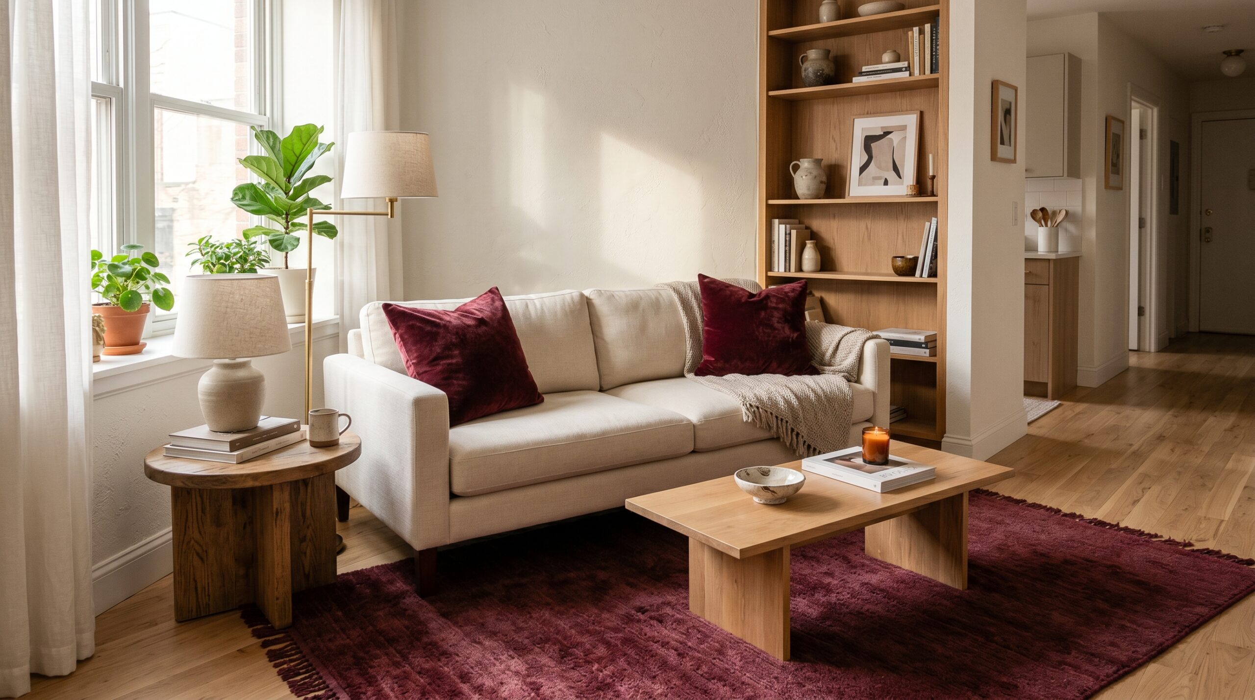
Chocolate brown is the color that makes the rest of the palette feel cohesive instead of competitive. It’s the warm grounding hue between burgundy and terracotta, and it absorbs the chromatic intensity around it so the room doesn’t read as a costume. The Nestl 18×18 chocolate brown velvet covers (set of 4) are one of the few in-stock options at this size and color on Amazon. Use two on the sofa and put the other two on bedroom or reading-chair seating to thread the color across rooms.
Navy (3 picks)
Navy is the riskiest of the five for small spaces. It reads cold without warm light support, and it can drop a low-ceilinged room visually. The trick is to put navy on one vertical plane (a single wall) or one horizontal plane (the rug), never both, and to balance it with warm-bulb lighting at 2700K.
6. Livelynine navy peel-and-stick wallpaper
The Livelynine 15.8 x 197 inch deep navy peel-and-stick is the renter-friendly accent-wall play. One roll covers about 21 square feet, so an 8×10 accent wall takes 4-5 rolls. Removes clean (I’ve tested this in two rentals). Use it behind the bed, behind a sofa, or as a back-of-bookcase liner where it acts as a frame for everything in front of it.
7. Artaimee navy blue velvet pillow covers (set of 2)
The Artaimee navy velvet pillow covers are the navy equivalent of the HWY 50 burgundy pair. Set of 2, hidden zipper, true navy with a slight velvet sheen that catches light. Pair them with the burgundy pillows for a contrast play, or with the chocolate brown set for a low-contrast tonal layering.
8. FALARK navy blue plush area rug (5×7)
Same factory weave as the burgundy FALARK above, swapped to a true dark navy. The FALARK 5×7 navy plush rug reads almost ink-blue in low light, which is the point. Best on light wood floors. Avoid if your floors are also dark; the rug will disappear instead of anchoring.
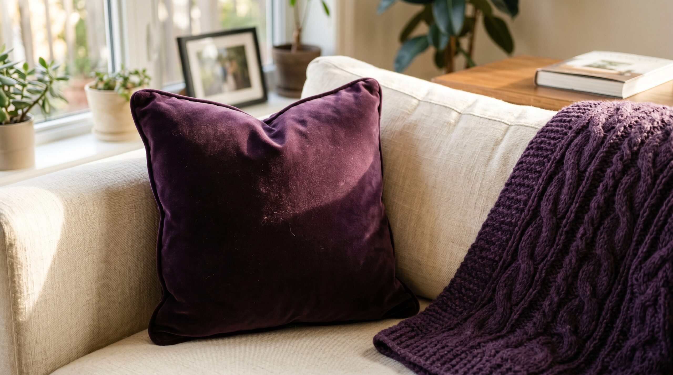
Amethyst (2 picks)
Amethyst is the dark-horse pick of the five. It’s underused right now, which means a single amethyst piece reads as deliberate rather than trend-following. It pairs naturally with chocolate brown and terracotta. It fights with navy. Pick one or the other for the room.
9. Artscope eggplant purple velvet pillow cover
The Artscope single 18×18 eggplant velvet cover is the cheapest amethyst test piece on Amazon right now (around $7-8). Reads as true amethyst against warm woods, more eggplant against cool grays. Buy one, live with it for a week, then decide whether the color belongs in your room before scaling up.
10. Aormenzy purple cable-knit throw blanket
The Aormenzy 50×60 dark-purple cable knit throw takes amethyst from accent to statement. The cable-knit texture keeps the saturation from reading as costume, and the 50×60 size drapes well on a sofa back or folds at the foot of a queen-size bed. Same brand and weave as the terracotta throw below, which is intentional. The matched texture lets you double-throw a sofa without it looking thrown-together.
Deep terracotta (2 picks)
Deep terracotta is the warm anchor at the end of the palette. It reads earthier than burgundy and warmer than chocolate brown, and it’s the hue that ties the saturated pieces back to natural materials (wood, clay, plaster).
11. Aormenzy dark terracotta cable-knit throw (60×80)
The Aormenzy 60×80 dark terracotta throw is the largest cut on this list. Use it as a full sofa cover (folded thirds), a bed throw across the foot of a queen, or a layered second blanket on top of a duvet. The cable-knit texture matches the amethyst throw, which means you can use both in the same room without them fighting.
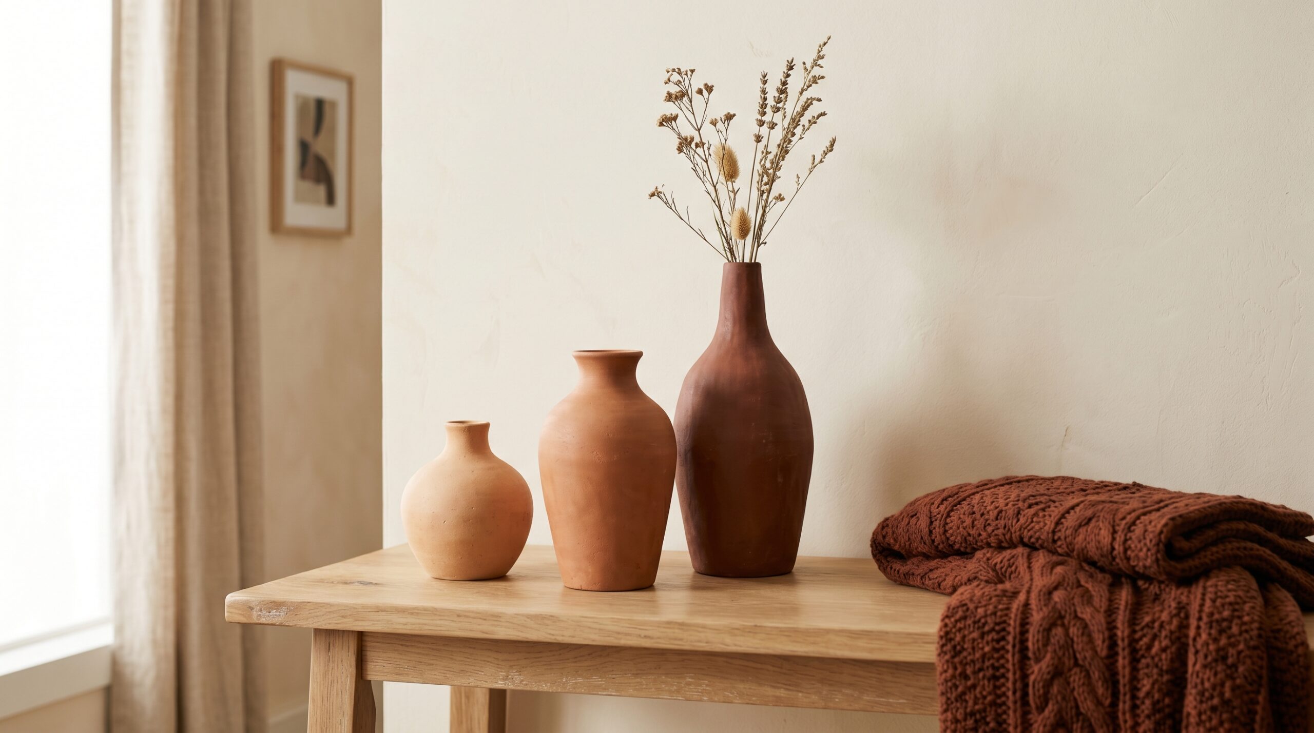
12. Dheureka terracotta ceramic vases (set of 3)
The non-textile pick on this list. The Dheureka set of three terracotta wide-mouth vases grades in height (tallest about 12 inches) and reads as unglazed clay. Stage them on a console or floating shelf and they do the work of a sculpture, which is the small-apartment trick: one good cluster replaces three okay pieces. Fill with dried pampas or eucalyptus, or leave empty.
How to layer the colors without it reading as costume
Pick a hue family and commit to it as the dominant. Burgundy or terracotta works best as the dominant in 600-900 sq ft. Then add ONE secondary hue (navy, amethyst, or chocolate brown) at about 25% of the dominant’s volume. Then add white/cream to about 30% as the visual rest. The rookie mistake is using all 5 hues equally and ending up with what looks like a paint store sample card.
A working palette example: burgundy dominant (rug + curtains + 2 pillows + 1 throw), chocolate brown secondary (1 pillow set), cream rest (walls, sofa upholstery, 1 throw). Five products, one secondary hue, the room reads layered instead of loud.
For comparison and contrast, the color-hex.com tonal complement tool shows which exact tones inside each hue family pair cleanly. Use it when you’re unsure if two reds are the same red.
What to look for when shopping the trend yourself
- True saturation, not pastel. If the listing photo looks washed out, the product will too. Filter to “deep” or “dark” color variants.
- Velvet pile depth. Cheap velvet reads as polyester. Look for “dense velvet” or “soft hand” in reviews, not just “velvet.”
- Removable for renters. Peel-and-stick wallpaper that’s been on the market 3+ years has more removal data points. Newer products are a guess.
- Returnable rugs. Saturated color in person varies from the listing photo. Buy from a seller with free returns so you can test in your actual light.
- Insert separately for pillow covers. Most velvet listings sell covers only. Pick up plain inserts in 18×18 separately so the cover fills cleanly.
FAQ
Won’t dark colors make my small apartment feel smaller?
Not if you follow the four rules in the section above: light flooring under the dark pieces, single feature wall not the whole envelope, 4+ hours of natural light, and a neutral on the largest piece (usually the sofa). The “dark colors shrink rooms” advice came from an era when rooms had recessed lighting and white walls were the only counterbalance. Modern warm-bulb lighting at 2700K does the same job and lets you use saturated color without the room caving in.
Can I mix all 5 colors in one room?
Technically yes, in practice almost never. Two hues plus cream is the working formula. Three hues plus cream works if you keep one hue under 10% of the room’s color volume. Four or five hues in one small room reads as overdesigned and fights for attention.
What about studios under 400 square feet?
Cut the list to three pieces: one pillow set in your dominant hue, one rug in the same hue, and the terracotta vase set as the sculptural counterweight. Skip the curtains and the wallpaper. In a true studio, every saturated piece needs to do double duty, so leave the architectural moves (curtains, accent wall) for when you have more square footage to absorb them.
How much should I budget for the full setup?
The 12-piece list above totals roughly $400 to $475 at Amazon list pricing. A working starter setup of 4 pieces (pillow + curtains + throw + rug, all in one hue family) runs about $200. The biggest single line item is the rug at around $50, which is also the piece that delivers the most visual change per dollar.
Is this trend going to date the way beige minimalism did?
Saturated colors as accents (pillows, throws, rugs) are a 200-year-old design language. They won’t date. What will date is the maximalist styling on top of them: too many accent pieces, too much pattern mixing, no negative space. Buy the colors. Edit the styling.
Related reading on SquareFoot Decor
- Dark cottagecore bedroom small apartment, the cottagecore-leaning cousin of this palette
- Mob wife aesthetic small apartment, a more saturated and glossy take on warm-toned styling
- Afrohemian decor renters small apartment, an earth-tone version that focuses on textile traditions